Digital Editorial Projects
Below showcases a selection of editorial images and illustrations that express a variety of public health and education-related topics. These graphics combine original or sourced illustrations, sourced photography, and abstract elements to convey sometimes challenging subjects. This approach demystifies and humanizes the content, fostering approachability and humility.
Using Music to Support Language Development in Children with
Hearing Loss
CLIENT
2U
Baylor University
CATEGORIES
Graphic Design
Collage
Web design
PURPOSE
To design assets for an article that shows how parents can integrate musical activities in to their child’s speech therapy.
RATIONALE
This project was an opportunity to explore how an article design might feel informative AND fun. To accomplish this, I first sourced a photo of a father and child with a hearing aid communicating with a speech pathologist/ doctor. I collaged illustrated elements and grain to give the photo context and color, allowing it to look musical and fun. I used sourced and manipulated more illustrations/photos to represent the different hearing loss types and create a spot graphic for the at home activities section.
Give and Take: A Nurse’s Role in Organ Transplantation
CLIENT
2U
Georgetown University
CATEGORIES
Graphic Design
Illustration
Web design
PURPOSE
To design assets for an article that explores the organ transplantation process and how nurses can support donors.
RATIONALE
Because organ donation is both a sensitive and visually graphic topic, my aim was to design the article to evoke comfort, safety, and instruction. I started with a color palette, prioritizing colors that either pulled from Georgetown University’s brand colors or were complimentary to them. This immediately set the calming visual tone and allowed the assets to feel native to the brand. For typography, I selected a thin san-serif. Sharp and clarifying, the san-serif helped to reinforce the tone. For illustrations, I used two approaches. I kept the organs medically accurate. However, I used some abstraction in the hero, likening the transplantation process to searching for the perfect fit. This solution conveys the process without stress and negative emotions that often marks this search. To prioritize the infographic, I kept the rest of the article design simple.
Is Sustainable Living Possible for Everyone?
CLIENT
2U
George Washington University
CATEGORIES
Graphic design
Data visualization
Web design
PURPOSE
To design assets for an article that investigates how sustainability practices can incorporate Americans living with disabilities.
RATIONALE
The intersection of sustainability and Americans living with disabilities is a layered conversation. My intention with this piece was to visually unpack these layers through color, texture, and typography and layout. I used photography in the backgrounds of graphics and behind data bar charts to contextualize the information. I picked bright colors for the palette, checking their accessibility against each other and the background to ensure they stood out.For typography, I selected a mono san-serif, giving the graphics and scientific quality.
Unsafe and Unwell: How Homelessness Affects Women and How to Help
CLIENT
2U
University of Southern California
CATEGORIES
Graphic design
Data visualization
Illustration
Web design
PURPOSE
To design assets for an article that explores how homelessness affects women.
RATIONALE
Homelessness needs to be discussed with care and compassion. Because this article was contributing to this dialogue, it could NOT feel alarmist, judgemental, or prejudice. It had to approach the topic with respect and be a helpful resource for users interested in helping women who experience homelessness. To accomplish this, I focused on using a calming, neutral palette. For the data visualization headers, I tracked out a lowercase serif to reinforce this calmness while also feeling floaty, conveying instability. For the illustrations, I drew the women from behind, allowing them to be anonymous, dignified, and supported. I used some of the same styling in the additional text modules to draw cohesion between the graphics and live-text sections.
Additional Images
Below is a showcase of additional hero images that use photo manipulations, illustrations, and collages to convey difficult topics.
The Risks of Drinking During Pregnancy and Fetal Alcohol Spectrum Disorders (FASDs)

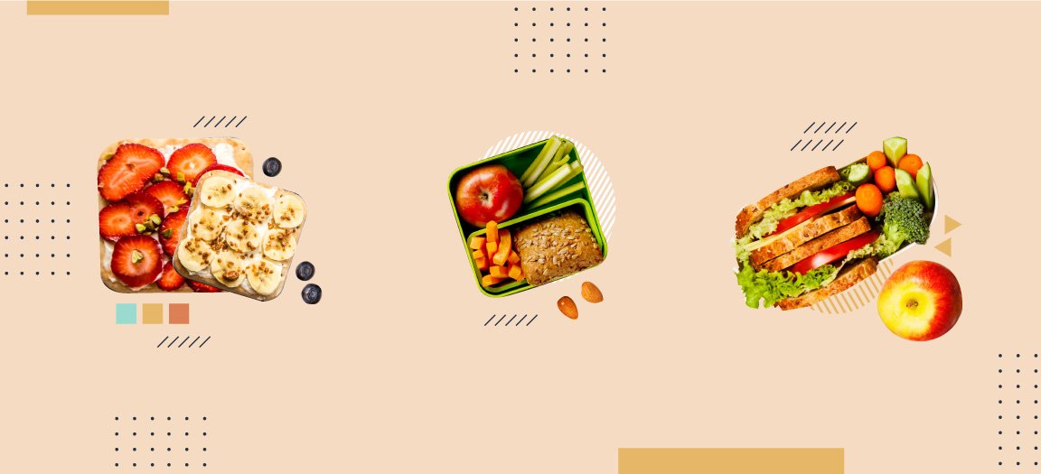
How School Lunch Programs Support Children’s Health, Even From A Distance

Why Do Black Women Have a Higher Breast Cancer Mortality Rate?

Highest-Paying Public Health Jobs

Trouble Swallowing or Chewing? Try These 6 Dysphagia-Friendly Recipes.

Disparities in Women Veterans’ Healthcare

How Communities Can Prevent Panic in Uncertain Times

Women’s Health: Tips for Vision Care

Sitting or Standing: Tips for Treating Your Body Well at Work

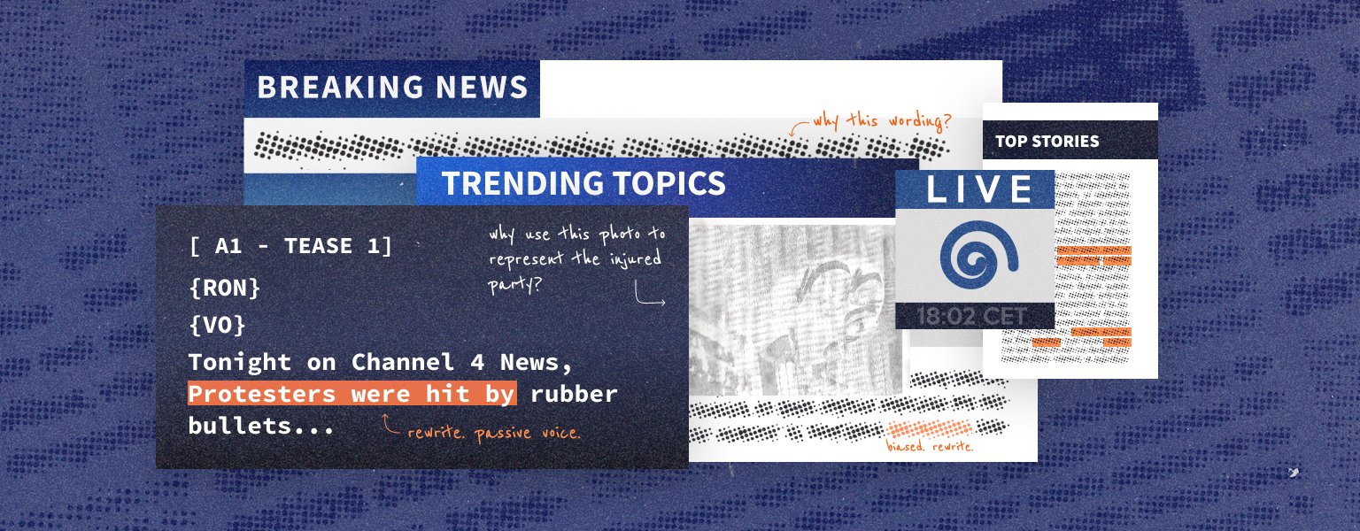
Guidance for Reporting and Writing About Racism

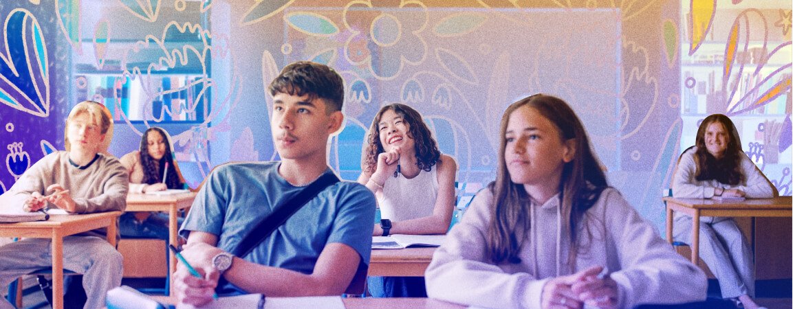
How to Create Gender-Affirming Classrooms

What Is Binge Drinking and Who’s at Risk?

Understanding Homelessness as a Public Health Issue


